Path to Care
Sustainably streamlining inventory management


Skills
UX Research, UI Design, UX Design, Prototyping

Timeline
May-Aug 2023
background
As an administrative assistant at PATH to Care, I was tasked with organizing our inventory tracking process. I had been working on the data aspect of the inventory tracking project for a while, and I was really excited to bring my knowledge of UX design to the project.
The PATH to Care Center leads the efforts to transform UC Berkeley into a campus free of sexual violence and harassment through prevention, advocacy, training, and healing. PATH to Care collaborates with the community to make social change to prevent and respond to violence, eliminate oppression, and foster a culture of respect.
Problem
Path to Care relies on student awareness to effectively prevent and respond to sexual violence and harassment at UC Berkeley.
To raise awareness, we host public and private events where we distribute informative and engaging materials. These efforts necessitate inventory management to gauge demand, monitor stock levels, and ensure efficient distribution. However, our inventory tracking process left much to be desired.
Discovery
What does inventory management look like at Path to Care?
From talking to my coworkers and observing the inventory checkout/checkin process, I found that there were several points of friction during the inventory tracking process.
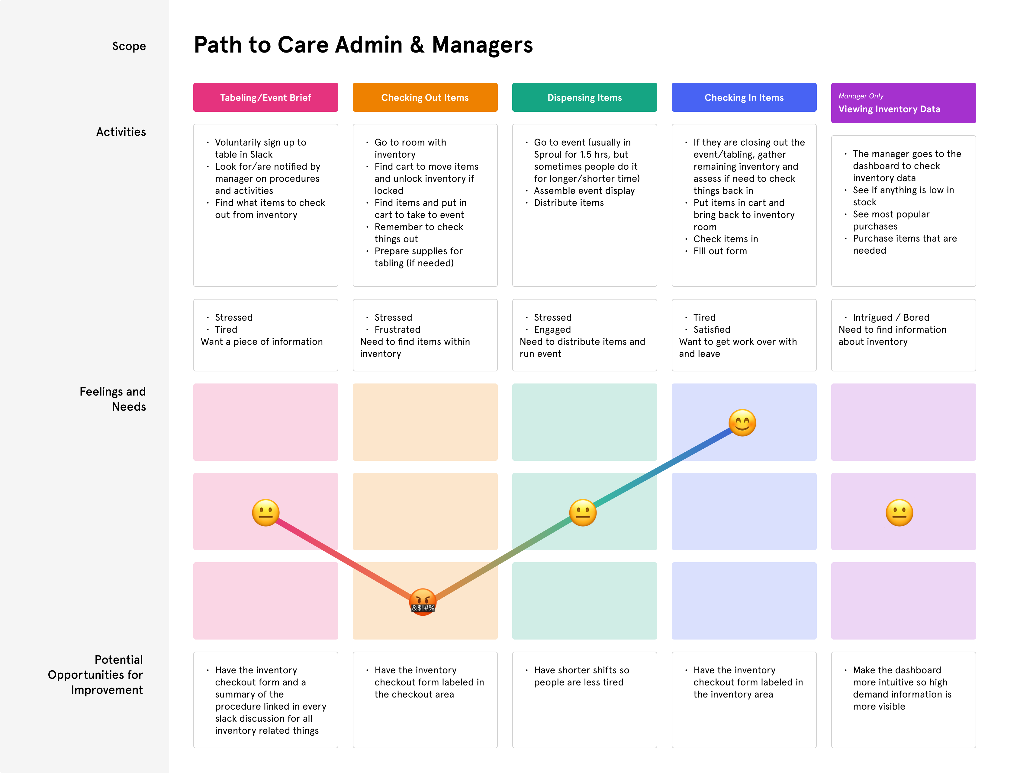
A look into the journey map of my user research findings.
insights
Employees and managers lack memorable, simple, and organized experiences when navigating inventory information.
People using the inventory who need to fill out the form usually have the more pressing tasks of running an event going on. They feel stressed, tired, and need to execute many tasks in a short amount of time. The former inventory experience only added stressors during this experience.

Inconvenience
Team members found filling out the form in addition to checking items in and out of the inventory frustrating. Team members would forget to fill out the inventory form, contributing to inaccuracies and making it challenging to maintain a comprehensive inventory record. It was hard to remember to record checking out and in inventory on top of everyone’s preexisting duties.

Disorganization
Our inventory tracking tools, including the form, Smartsheets, and dashboard, became more complex and difficult for staff to understand, hindering the overall efficiency of our inventory management system. Additionally, as Path to Care has many student employees, it is important for incoming staff and managers to easily understand and navigate the checkout process.
NARROWING the problem
How might we help current and future staff and admin navigate the inventory form, dashboard, and inventory guide?
I wanted to focus on delivering this information in a memorable way that was still consistent with Path to Care’s brand.
DESIGN ITERATIONS
Refining explorations
With the cumbersome nature of checking in/out inventory items, it was important to design solutions that prioritize ease of access. Employees preferred simple layouts with the inventory form, dashboard, and dashboard tutorial readily accessible. As the website could be used while employees were running events and moving around, it is important to access the website on different devices.

Iteration 1
Using visual hierarchy and relevant graphics to display all components in a simple manner

Iteration 2
Using visual elements to effectively present large amounts of tutorial information
Solution
A memorable centralized inventory tracking hub that helps staff quickly and easily navigate the inventory tracking process.

Accessible Form Link
Prominently placed link to the inventory tracking form to address the issue of people forgetting to complete the form when checking items in or out. A simple layout and minimal text creates easy access to the form.

Dashboard Creation
Developed a comprehensive dashboard for your boss to provide a holistic view of inventory data, allowing for quick decision-making and strategic insights.

Dashboard Tutorial
Included a user-friendly tutorial for editing the dashboard, making it accessible to all team members, including the student admin assistants, who often experience high turnover.

Workflow Integration
Added a QR code at the check-out location, allowing for quick and easy access to the inventory tracking system. Also integrated the website into Path to Care's work materials, ensuring that team members have easy access to inventory tracking wherever they are.
CLIENT FEEDBACK
After rolling out the website, inventory activity increased by 50%. The staff loved the fun, professional feel of the site and found it easy to navigate. They found it refreshing while still capturing the feeling of the brand.

wishes
I put a lot of effort into understanding accessible web design while building the prototype, but I encountered some limitations with the website. I wish I had contacted framer support to improve the prototype’s accessibility. Additionally, I was unaware of how to properly design accessible data visualizations at the time. I wish I used a pattern fill on top of colors to differentiate item types in the last diagram.
REFLECTIONS
Key learnings
It was really exciting to connect my interest in UX and UI design to the lifecycle of the inventory process within an organization that I worked for. I am grateful to my coworkers for giving me their time and feedback throughout the project.
1
Through this project, I learned about creating dashboards that are intuitive and organized by content type. There are many different types of dashboards with different purposes. Our dashboard was quite simplistic and consolidated, so it contained information spanning from what is currently in/out of stock, trends, and inventory data over time, which had to be organized in a specific manner. The feedback and information I gleaned during user interviews and usability testing took this project in a direction I never imagined, and illuminated many, many blind spots. Seeking regular feedback from the very beginning to the very end of this process made my work easier and stronger.
2
I spent a large portion of my time working on refining website copy. The Path to Care inventory website pushed me to hone my ability to translate complex information into digestible content without sounding redundant or compromising its integrity. It was challenging, but I learned a valuable skill in writing with clarity.
3
I also learned that less is not always more, even in web design. In my personal life, I can be quite kitschy and maximalistic, as I love adding flourishes to things to express myself. When I was building this website, I wanted to embrace minimalism to make the site simpler. My user interviews showed that it was important that there were visual elements that represented the purpose of the product, and that the design benefitted from being fun, and even a little flashy.
Solution
arrow_downward